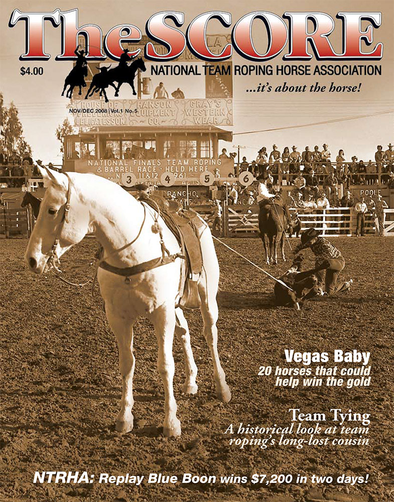
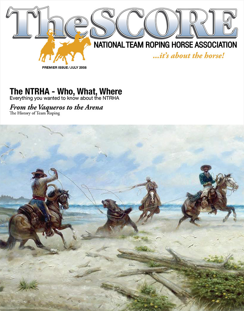
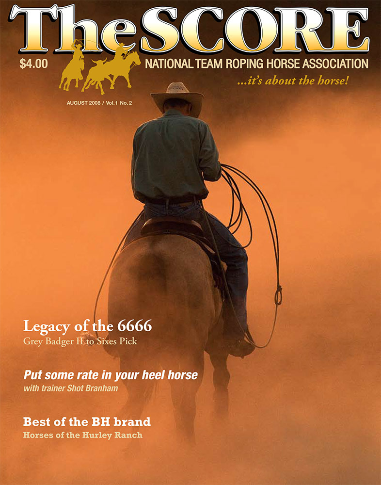
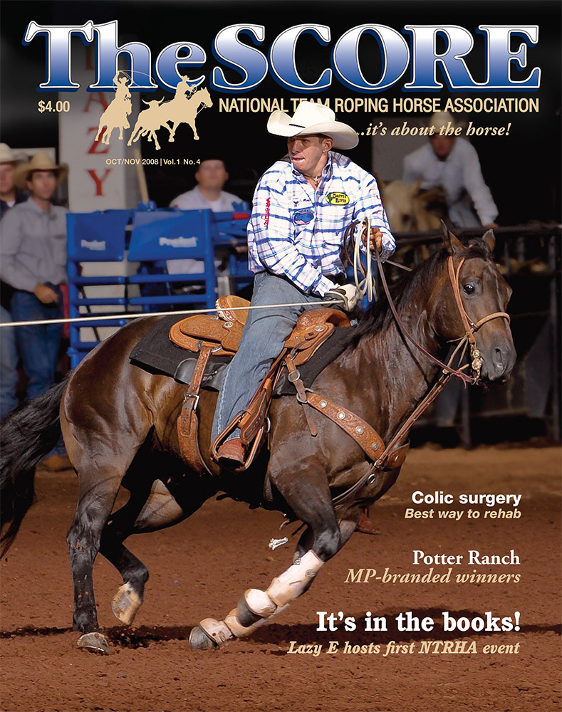
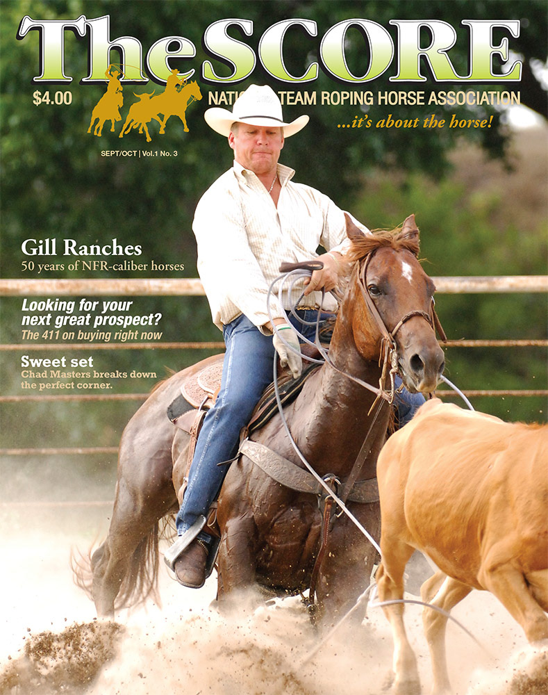
Problem: Launching a magazine from scratch means the first covers set the legacy for everything that follows. This one needed to look different and subtle, reflecting the ideals of a startup sport horse association from issue one. Every cover had to say "It's About the Horse."
Constraint: Very little existing photography or art in the team roping world actually focused on the horse. Most imagery centered on the ropers. We needed strong horse-forward shots, and the design couldn't compete with or bury them. The masthead had to earn its place, not just sit on top.
Solution: We chose a timeless font that avoided western horse-theme tropes, bold with real contrast. We limited ourselves to just a few typefaces that could hold up issue after issue, and made sure the design supported the photography instead of leaning on typographic tricks to carry it.
Result: Nothing like it existed in the horse industry at the time. It informed members, but it also functioned as advertising that drove new membership. Producing one issue a month with a staff of two to three people was ambitious, and I'm genuinely proud of what we pulled off.