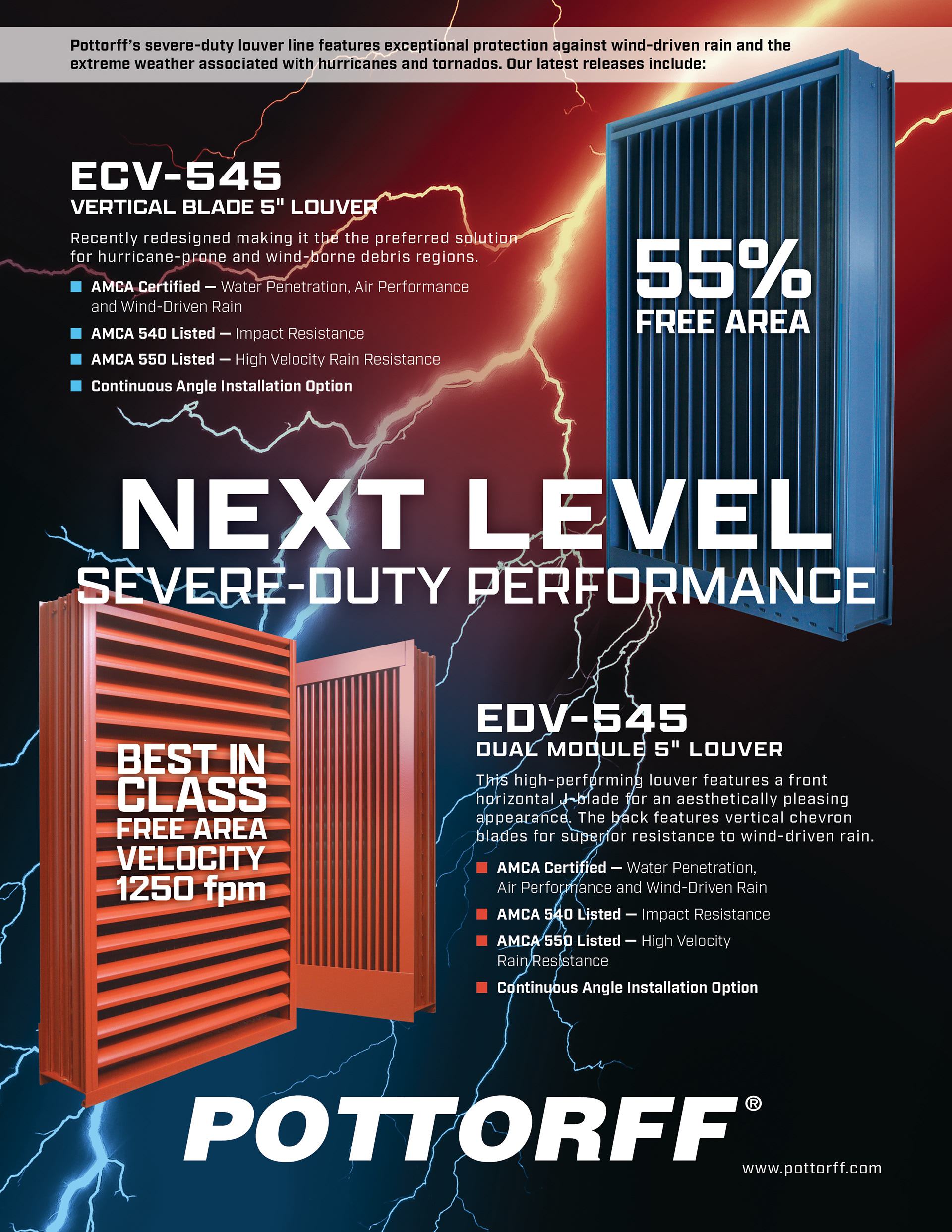
Problem: Show the importance and capabilities of two high-performing louvers in a single ad.
Constraint: Each louver had to stand on its own, almost like two separate ads sharing one page, while staying eye-catching. Not an easy task when the subject is photos of louvers.
Solution: I centered the headline vertically to create a natural divider, giving each louver its own half. Rather than aligning them evenly, I placed the smaller louver in the upper right and the larger one in the lower left, giving the composition real weight and asymmetry instead of a static split. Product info settled into the negative space around each. A lightning bolt image ran through the background to lead the eye, with a subtle color gradient shifting for each product to tie the whole thing together.
Result: The ad generated real excitement and posted the highest click rate of the digital campaign. The photography held up well enough that I reused it across other materials too.